Single Origin - Senses Campaign
Creative Direction | Art Direction | Campaign
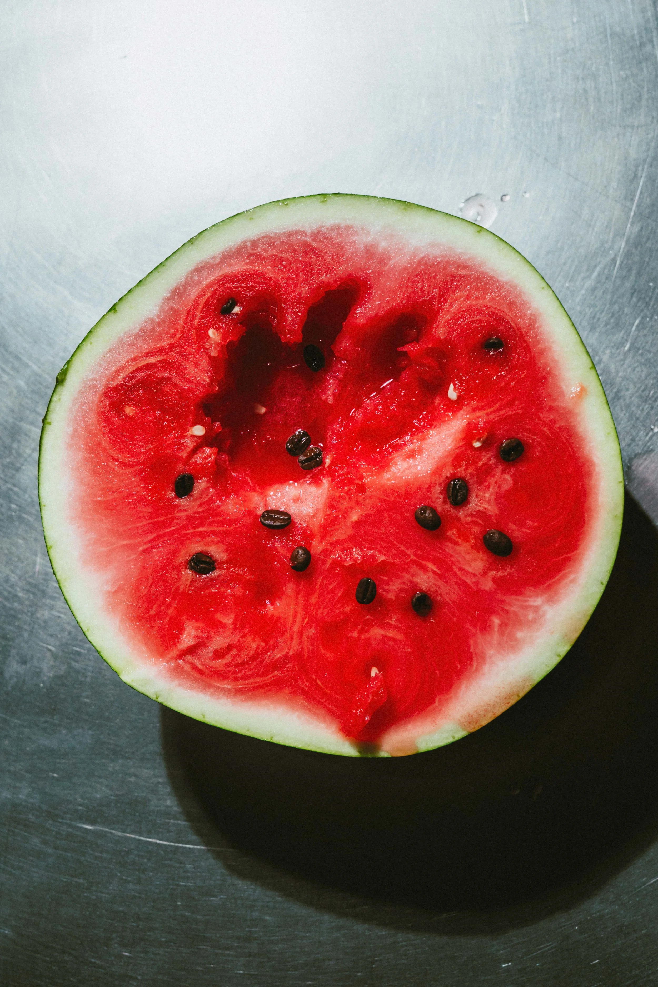
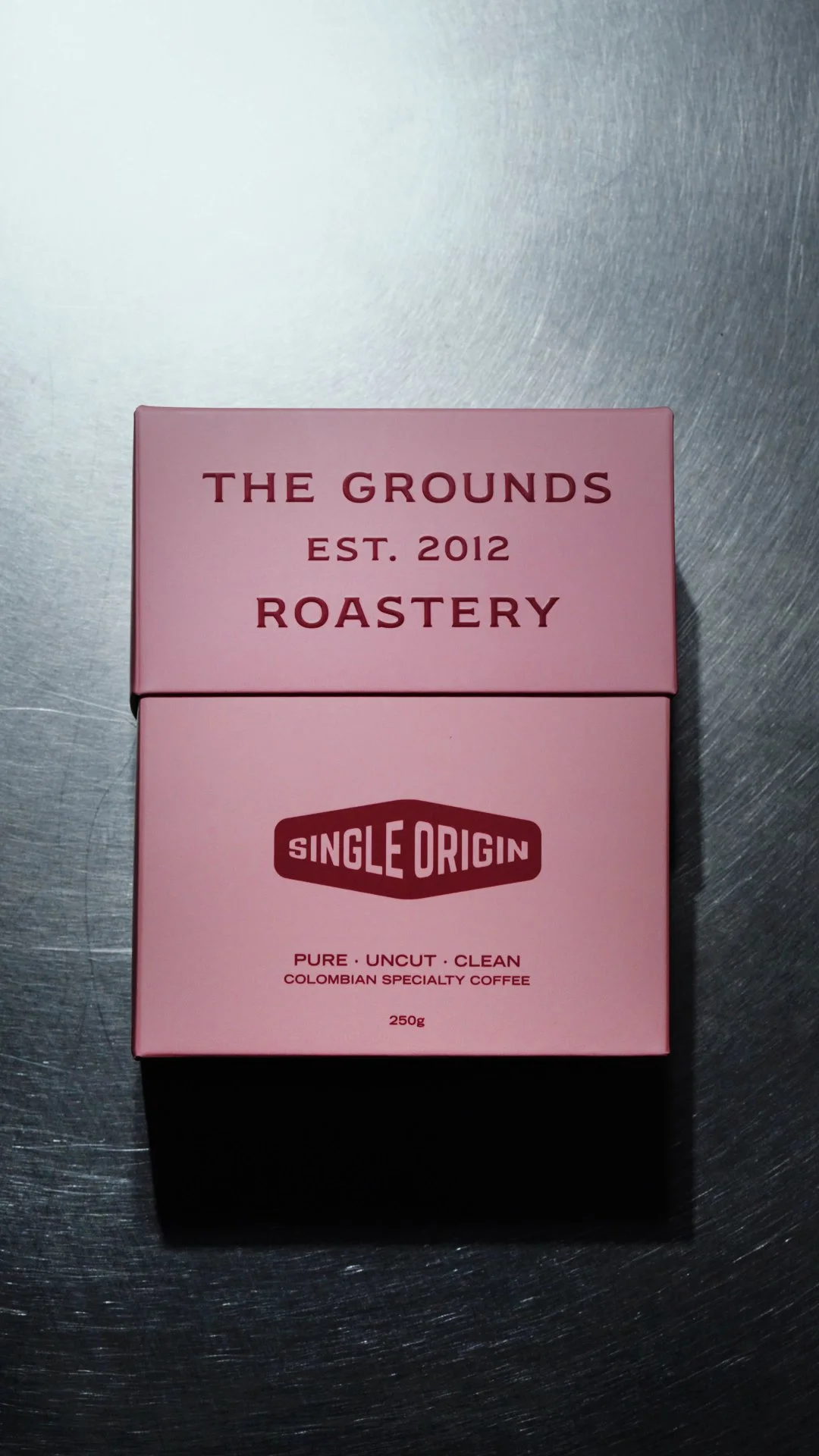
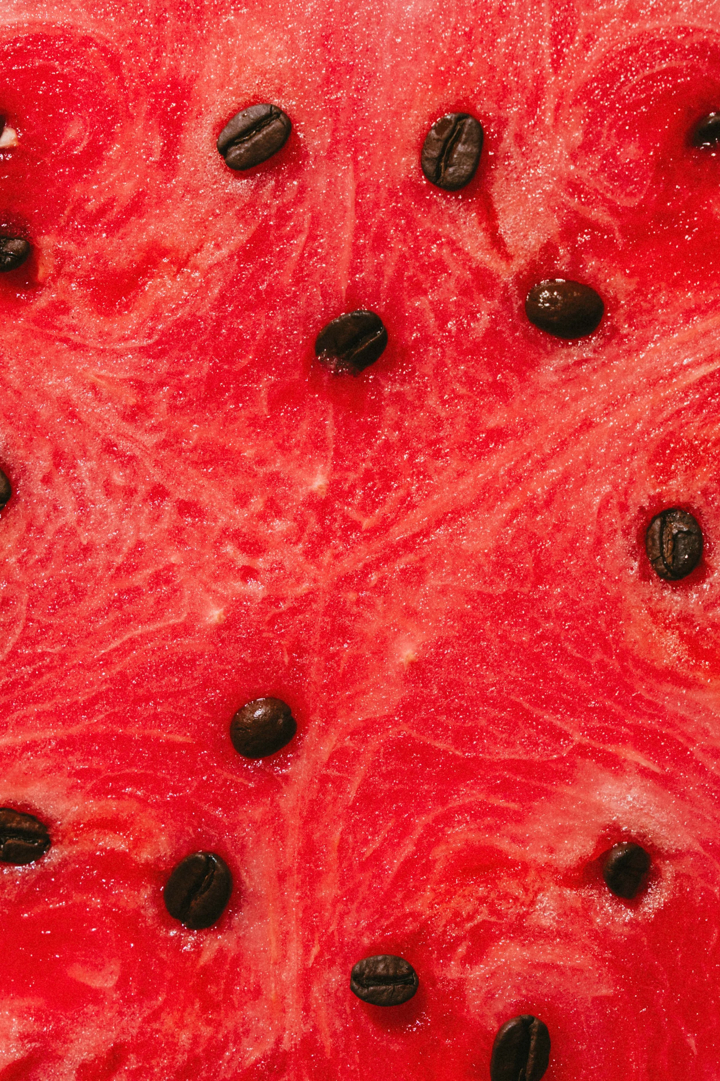
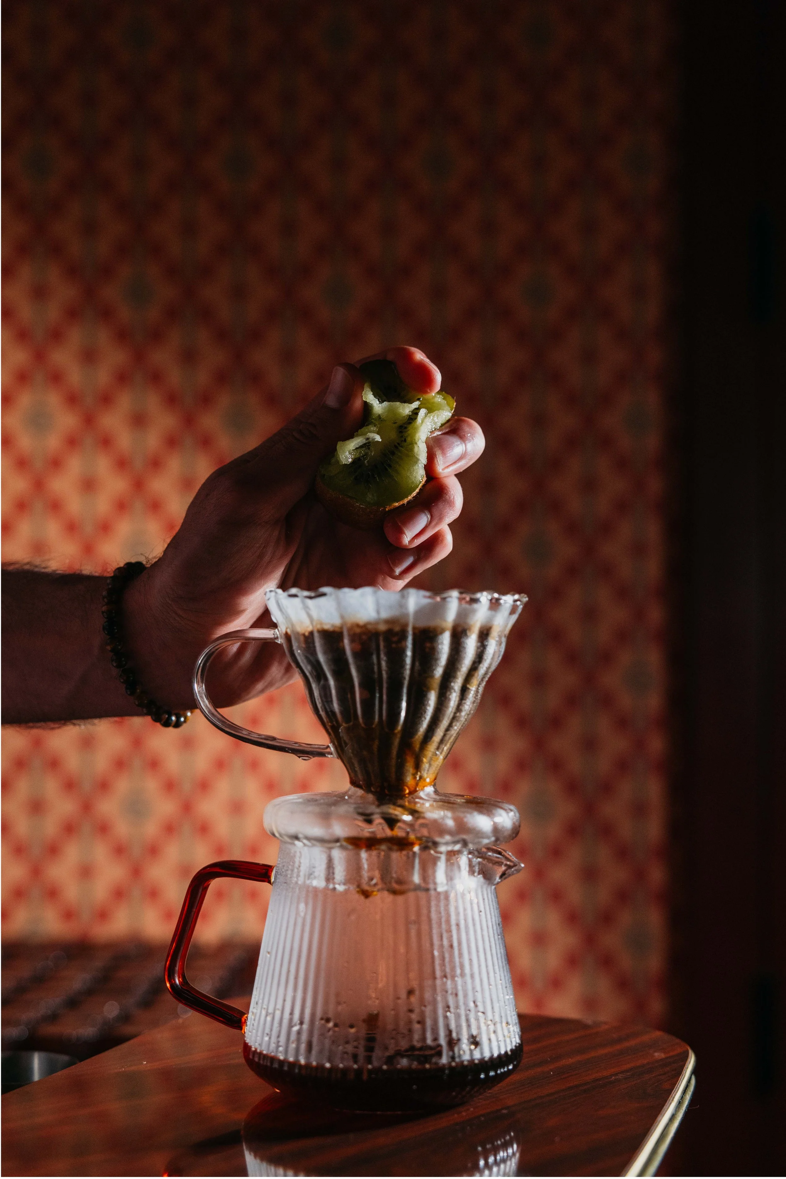
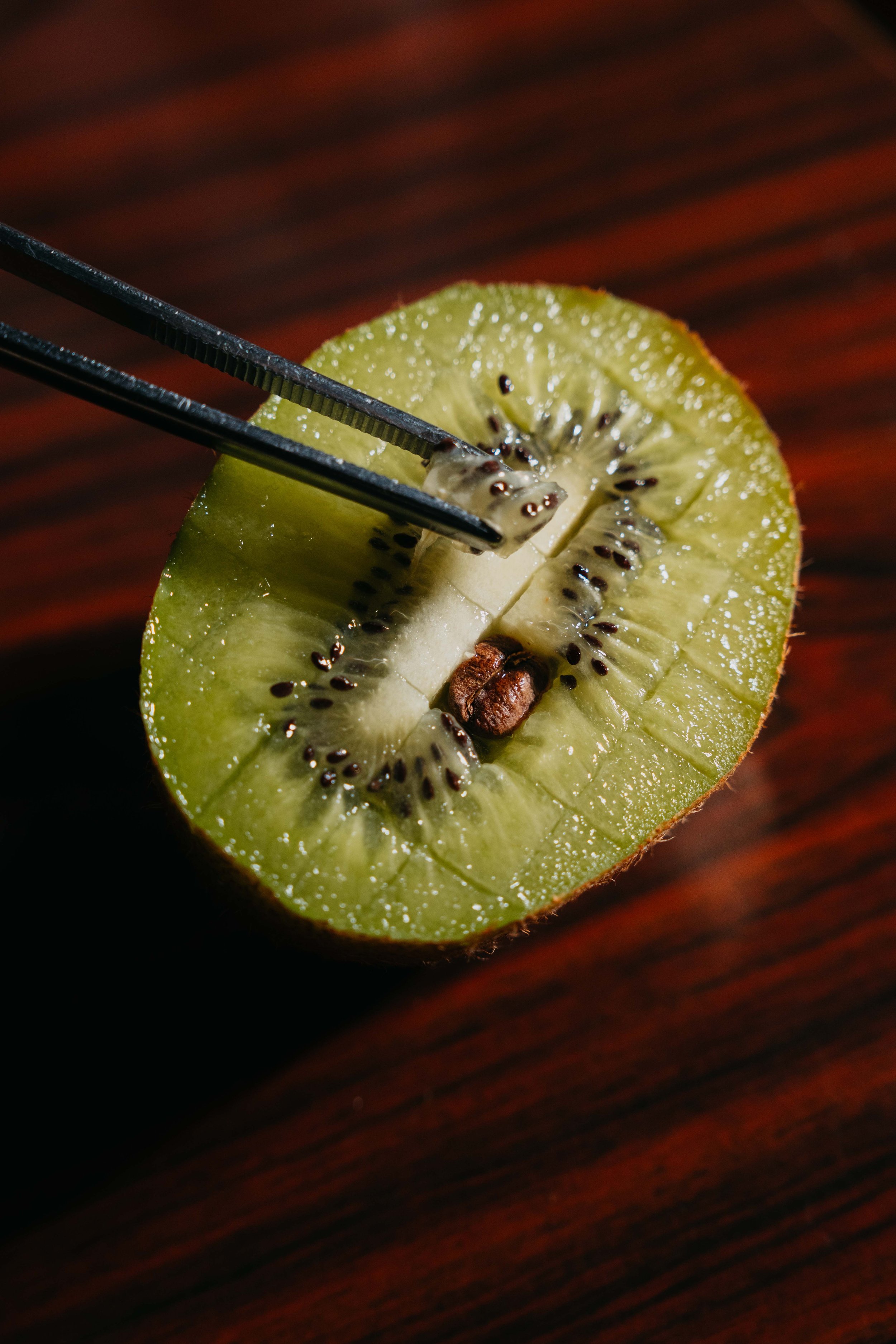
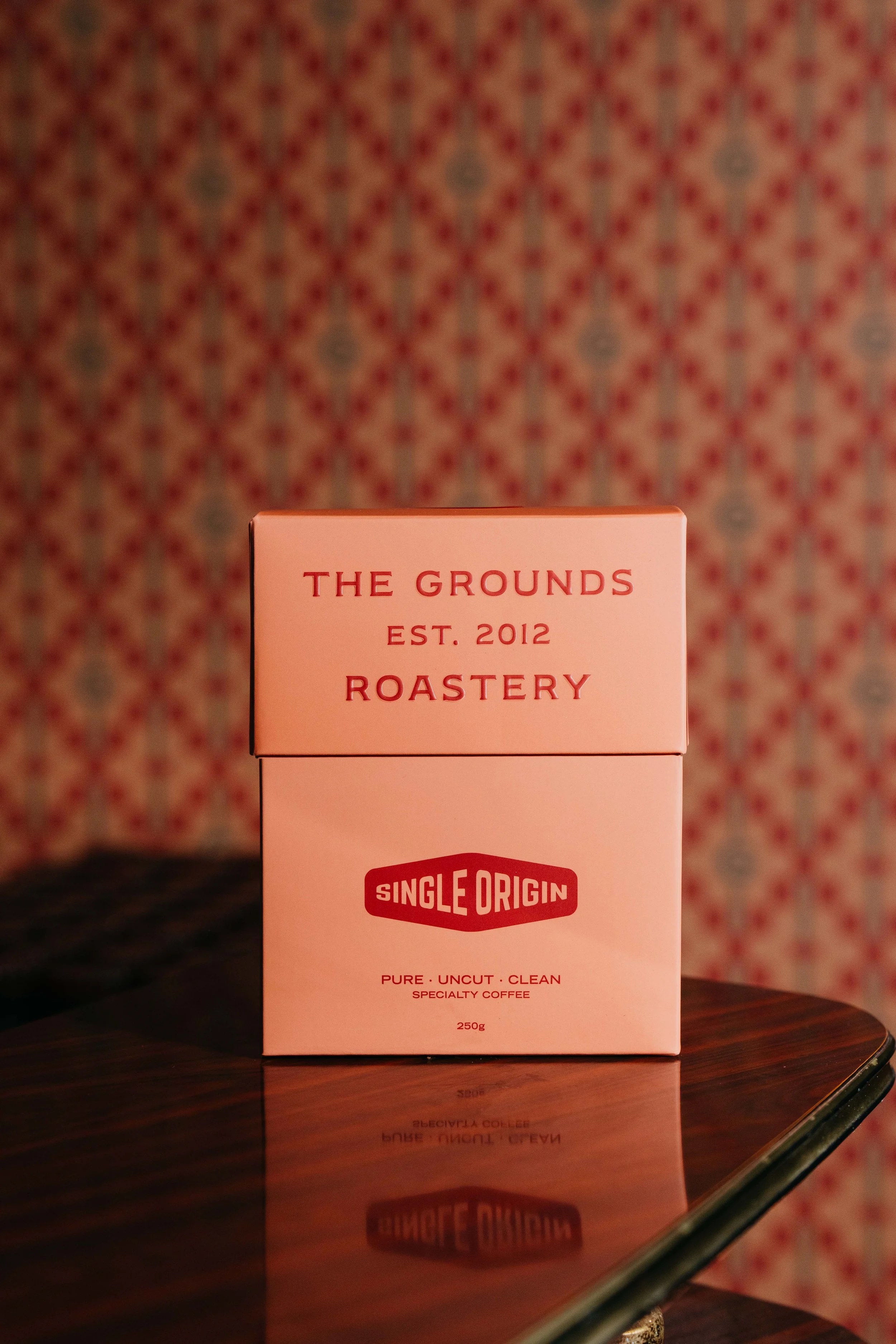
This creative direction project explores how flavour can be translated into a cohesive campaign look and feel. Each Single Origin coffee was brought to life through a sensory-driven visual narrative, using environment, colour, and texture to express its unique tasting notes. The watermelon concept contrasted the fruit’s fresh vibrancy against a cold stainless-steel kitchen, allowing the pink tones to punch through with clarity and energy. In contrast, the kiwi direction embraced warmth — a softly lit room with carpet and patterned wallpaper evoked the cosy, tactile feel of kiwi skin. Together, these campaigns demonstrate how strategic art direction can turn subtle flavour cues into immersive, memorable brand experiences.
